The Anglepoise
24.09.25

The Anglepoise
When I was younger I was completely obsessed with cars. On the walk to nursery my dad and I would count Mini Coopers, and by the time I was in primary school I could recognise most cars just from their lights or the design of their alloy wheels. I never thought of it as design, it was just something I noticed out of curiosity.
That early interest in how cars were shaped and put together has stayed with me, and it has influenced a lot of the choices I have made in my life, both in and out of education. It also meant that when I eventually came across objects that showed the same kind of mechanical logic and careful thought, I recognised that feeling straight away. The Anglepoise was one of the first things outside of the automotive world that gave me that same sense of “this is made properly”, even if I couldn’t explain it at the time.
Where It Came From
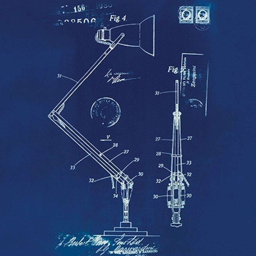
The story of the Anglepoise starts in the early 1930s with George Carwardine, an engineer who worked in the car industry. He was experimenting with springs for suspension systems and eventually came up with a mechanism that could hold an arm in balance wherever you placed it. It didn’t need tightening or adjusting, it just held itself.
He teamed up with Herbert Terry and Sons, who made springs, and together they released the first lamp in 1932. It was called the 1208 and it was designed for workshops and factories. A few years later they brought out the 1227, which is the version most people recognise today. Even now, you can look at a modern Anglepoise and still see the same logic in the way it works.
It also caught the attention of fashion and culture figures. Margaret Howell, who is known for her stripped-back, functional aesthetic, collaborated with Anglepoise to produce a series of lamps in her signature muted colours. She has talked about the lamp as “a perfect example of practical design” and featured it in her shops as part of her visual identity. Paul Smith followed with his own editions, using his trademark colour blocking. These collaborations didn’t change the mechanics but helped bring the lamp to a wider audience who might normally overlook industrial objects

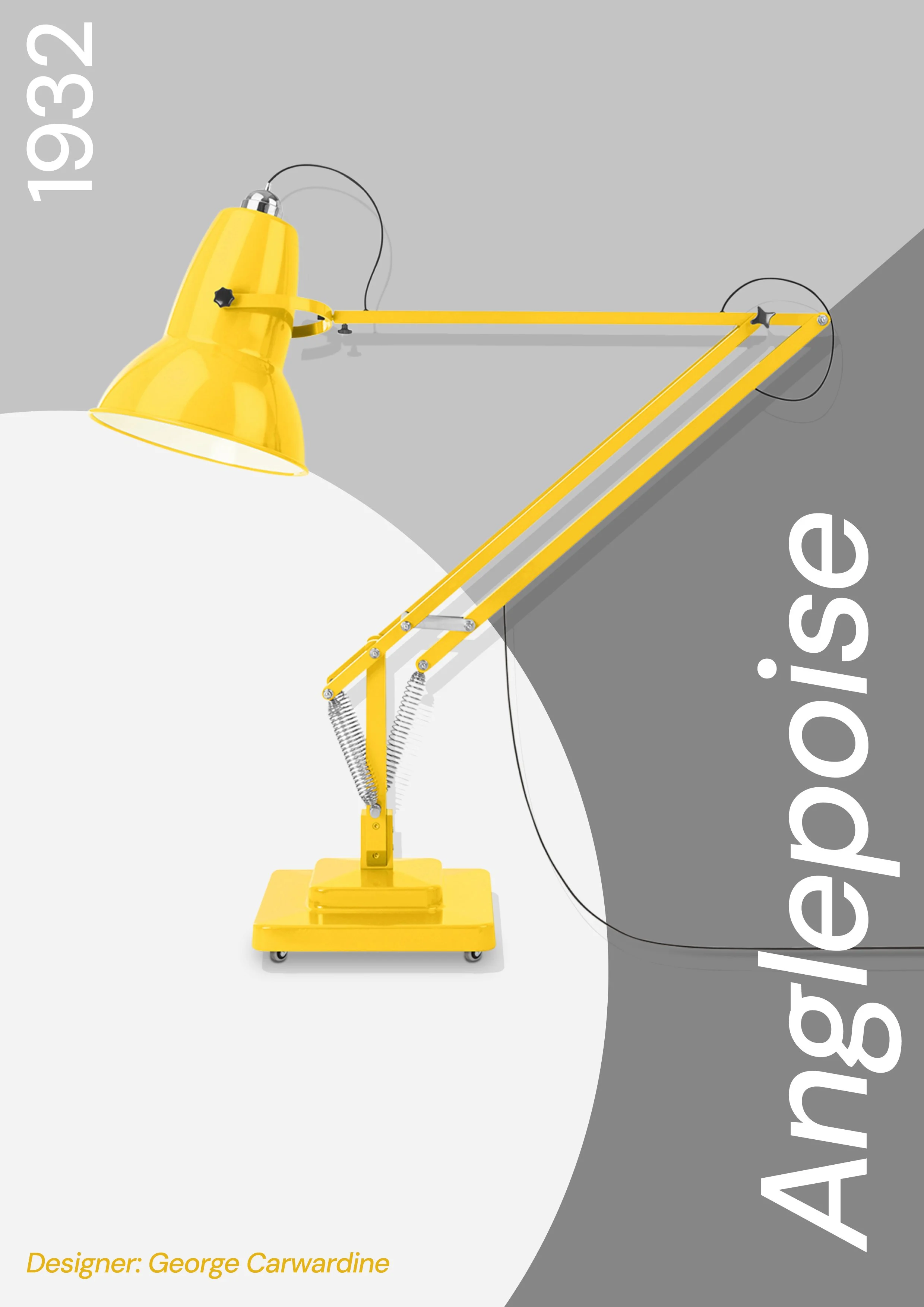
This is a poster I designed, inspired by Jonathan Glancey’s “Spring Light.” I played with the colours as well based on some of the most famous colour combinations that have been seen adorned on the lamp in all of it’s different forms
What Makes It Work So Well
Using an Anglepoise feels different to using most lamps. Even as a child I could tell something about it was right. When you move the arm it doesn’t wobble or drift, it just holds the position you put it in. The base has enough weight that you can swing the lamp forward without worrying about it falling over, and the arms are long enough to be useful without feeling awkward or flimsy.
The shade directs the light exactly where you need it, and the important parts are all visible. You can see the springs and the joints, so the whole thing makes sense at a glance. Nothing about it feels hidden or over designed. It is very clear about what it is and why it works.
How It Became a Classic
It might have started in workshops, but the Anglepoise became a classic because people found it genuinely pleasant to use. The way it moved and held its position made it something you got used to quickly and didn’t want to give up.
Artists were some of the earliest adopters. Barbara Hepworth used Anglepoise lamps in her St Ives studio because she needed consistent light while carving and drawing, and you can spot them in old photographs of her workspace. Roald Dahl (a childhood favourite of mine) famously had one in his writing hut, directly above the board he laid across his lap. His biographer even pointed out that the lamp was one of the very few objects he refused to replace because he trusted how it behaved.
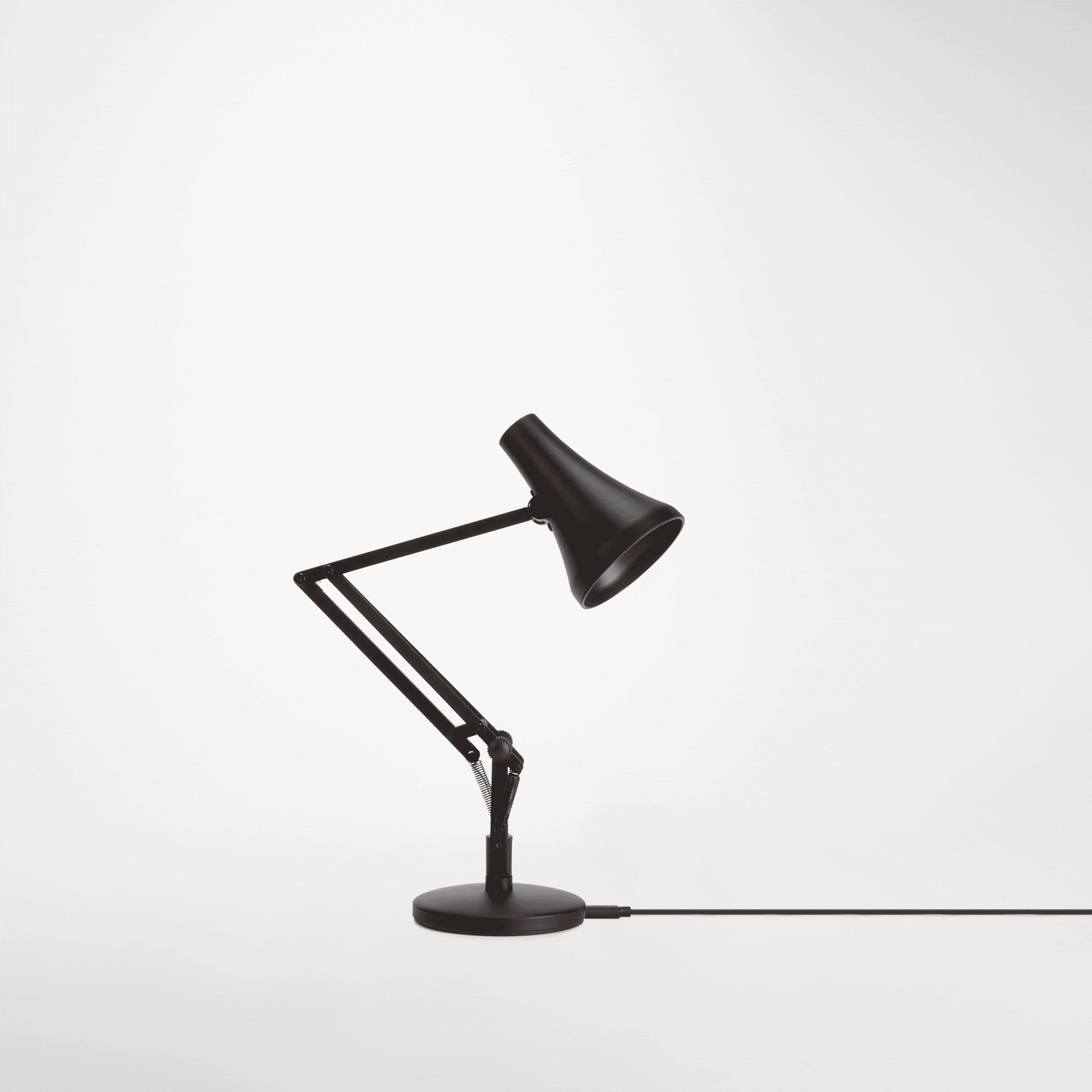
Poster Design

Designers took the lamp even more seriously. It appears in Phaidon’s 1000 Design Classics, where it is described as “a model of British functionalism”, and it is also featured in multiple publications by the Design Museum, usually as an example of engineering thinking applied to a domestic object. The Design Museum often highlights how rare it is for a piece of lighting to remain almost mechanically unchanged for so many decades.
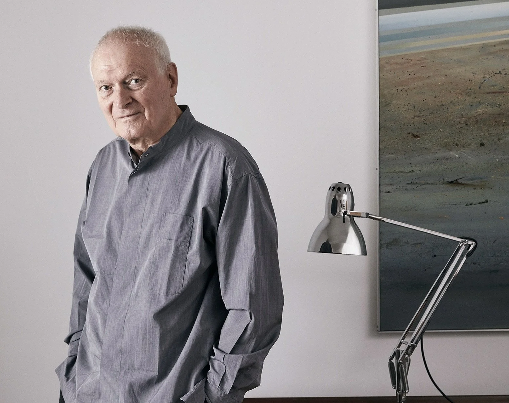
Industrial designer Kenneth Grange, who worked on everything from the Kodak Instamatic to the InterCity 125 train, was such a fan that he eventually became Anglepoise’s Design Director. He once described the lamp as “a small lesson in balance and restraint”, and his update, the Type 75, is now one of the brand’s most recognisable modern pieces and the on that i own myself. Grange’s involvement did a lot to cement the lamp’s reputation within the design community, since he was known for his no-nonsense approach to products that people use every day.


Even in pop culture, its presence is hard to ignore. Pixar’s Luxo Jr., which became the studio’s logo, was directly inspired by the Anglepoise movement. John Lasseter mentioned in interviews that the personality of the lamp came from the way real Anglepoise arms reacted to pressure and balance.
In the end, its status didn’t come from hype or branding. It came from steady, consistent use by people who needed a reliable tool. Artists, writers, designers, architects and even fashion figures kept choosing it, and over time it became part of the visual language of studios, offices and homes. As the decades went on it appeared in different sizes and variations, from compact desk versions to oversized statement pieces, but every one of them kept the same core mechanics and the same logic that made the original work so well. It earned the title of a classic the slow way, which is often the most convincing way.
Seeing It as a Designed Object
I didn’t think about this at the time, but looking back the Anglepoise was probably the first object that made me aware of design in a practical sense. I noticed the smooth movement, the way it stayed put, the feel of the switch, and the fact that it was simply nicer to use than any other lamp I had seen.
It wasn’t a sentimental thing, I just remember thinking it was better in a very clear, straightforward way. It made me pay more attention to the small details that separate something that simply works from something that works well, and that’s something I still notice when I look at products now. I’ve had a Type 75 of my own for a few years, and it has settled into my desk setup so naturally that I barely think about it. It sits beside me while I work, does exactly what I need it to do, and is so unintrusive in the way it behaves that it almost feels invisible until I move it. This it what makes it “great design” in my mind.